I Discovered the 3 Most Annoying Things About iOS 18. Here’s How to Fix Them
The iPhone's latest operating system update adds some great new features. But these three bug me.

I love my iPhone—currently the iPhone 15 Pro Max—and have been a devoted iPhone user since Apple launched the first model in 2007. However… nothing is perfect, right? I still have a few complaints, especially when it comes to the software.
With every new mobile software release, there are always features or settings that I don’t like as much, and that’s definitely the case with the latest version of iOS 18.
Yes, there are a lot of things to like about iOS 18. I’m a big fan of the new RCS support, which makes texting with Android users a lot better. I also like that I can send text messages via satellite when I don’t have cell service. And I’m really happy that I can finally enable lock screen buttons (which, frankly, we should have been able to do a while ago).
But there are also things I hate, as always.
That’s why I’m writing this story — and the reason I write this story every year, in fact — because there’s always something I really don’t like and want to change. Here are three features I don’t like about iOS 18 and how to fix them.
Get Rid of All the Clutter in the Photos App in iOS 18
Well, I’ll be honest, I really don’t like the redesign Apple gave the Photos app in iOS 18. I get what it means, but it feels awfully cluttered by default. I don’t want my main camera roll to constantly remind me of vacations or wallpaper suggestions with photos and videos I’m not looking for.
Thankfully, Apple gives you the ability to customize the Photos app to your liking.
When you first open the Photos app, you’ll see a grid with all your photos and videos, which is the Library view you’re used to, but at the bottom, you’ll notice that the navigation bar is gone, replaced by collections of your recent photos and videos that you’ve taken with friends, family, and pets.
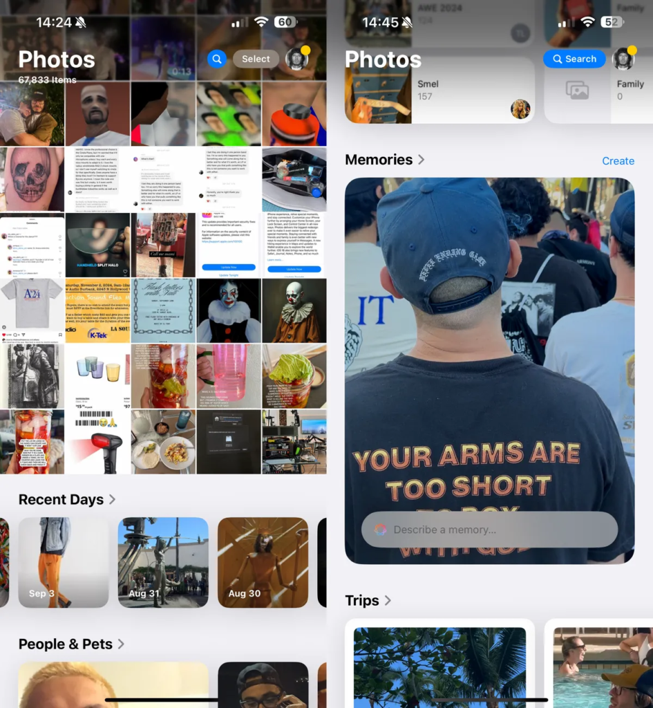
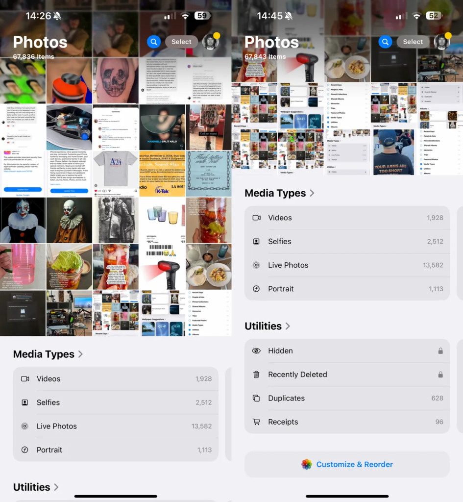
If you scroll down, you’ll still see random groups and albums, like Pinned Collections, Shared Albums, Memories, Travel, Featured Photos, and Background Suggestions, which were all in the Albums and For You tabs. Now, everything is grouped together in one place on iOS 18, which is the main view. While this might be useful for some people, I don’t need to see everything at once. I just want to see my Camera Roll and a few albums.
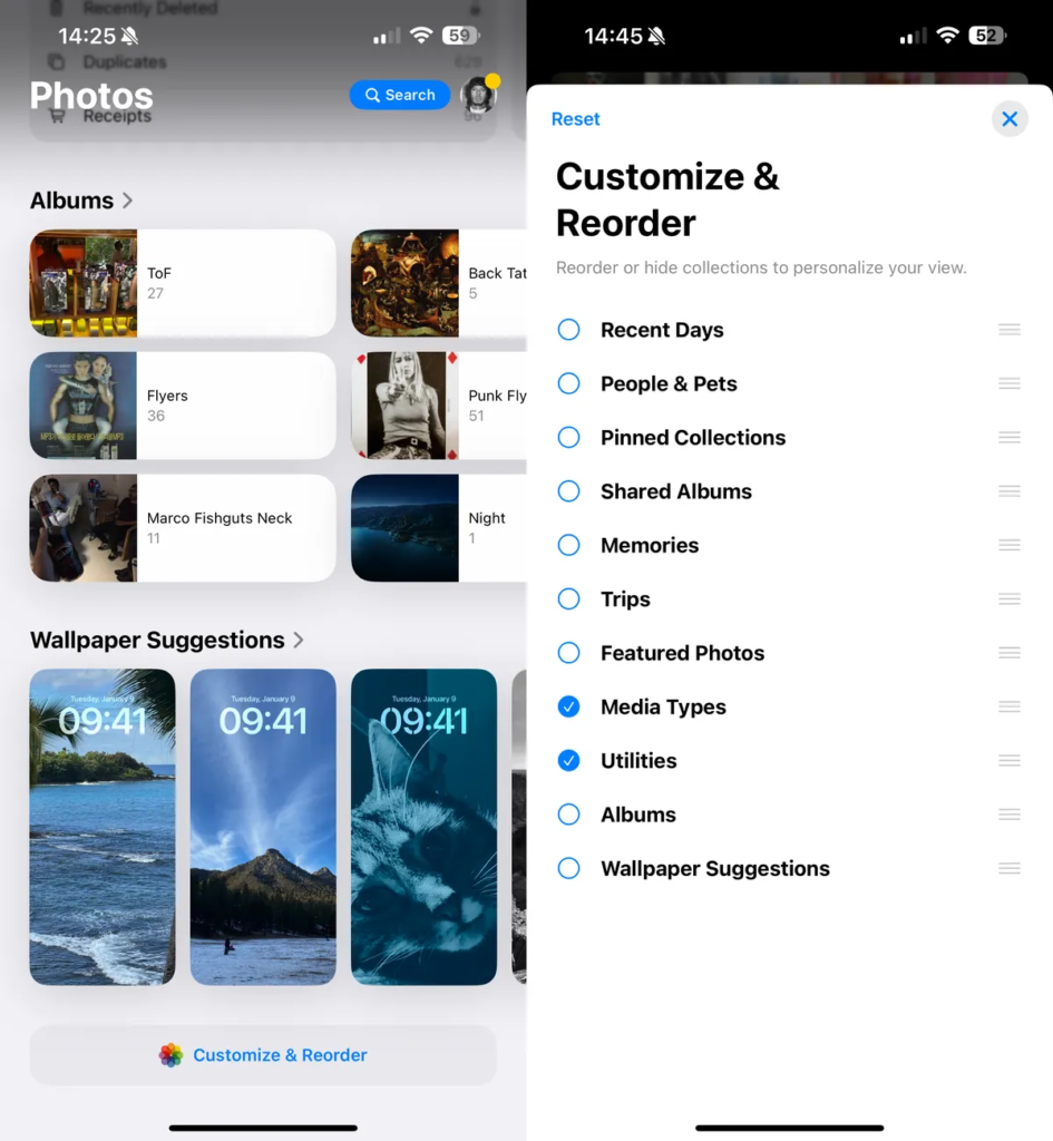
To customize the Photos app, scroll down and tap Customize & Reorder. Here, you can deselect any groups you want to hide from the main view. You can also arrange the order in which they appear. I don’t want background suggestions and most of the other options, so I unchecked everything except Media Types (organizes your media into Live Videos, Photos, etc.) and Utilities (Hidden and Recently Deleted Albums, Received, Documents, etc.).

Of course, you won’t be able to see the Collections Apple created for you, as well as many other albums, but if you don’t use them, you better do, because you can still find any photo or video you want by going to your Camera Roll or using the search button at the top.
Remove all the new Control Center pages on iOS 18
I use Control Center all the time to quickly connect to Wi-Fi, turn on Do Not Disturb, turn on Dark Mode or Low Battery Mode, and discover new songs with the Music Recognition control. However, with iOS 18, Apple has expanded the design of Control Center and now contains multiple pages of controls, some out of the box and others that you can create yourself.
The problem is that I don’t need multiple pages for Control Center – I just need one. I don’t want the clutter of multiple pages, because I can cram all the controls I need onto a single page. But that’s not the only problem. I also find that now when I try to swipe out of Control Center, I end up accidentally scrolling through Control Center pages, and I get stuck… and annoyed.
Fortunately, there’s an easy way to make Control Center look like it did before, with just one page.
In Control Center, which you can access by swiping down from the top-right corner of the screen, swipe up to access additional pages and tap any empty part of the page. This will highlight the control – tap the Delete Control (-) button in the top-left to delete the control and the page.
Do this for every other additional Control Center page you have, until you’re left with just the main Control Center.
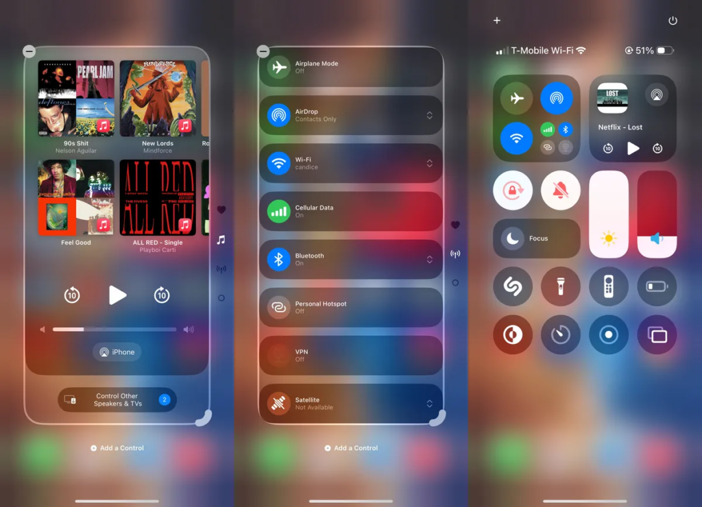
Now, when you try to navigate out of Control Center, it won’t get stuck on other pages. Instead, you’ll be able to navigate out just as easily as before.
Stop Accidentally Disabling the New Siri in iOS 18.1 (Public Beta and Developer Users Only)
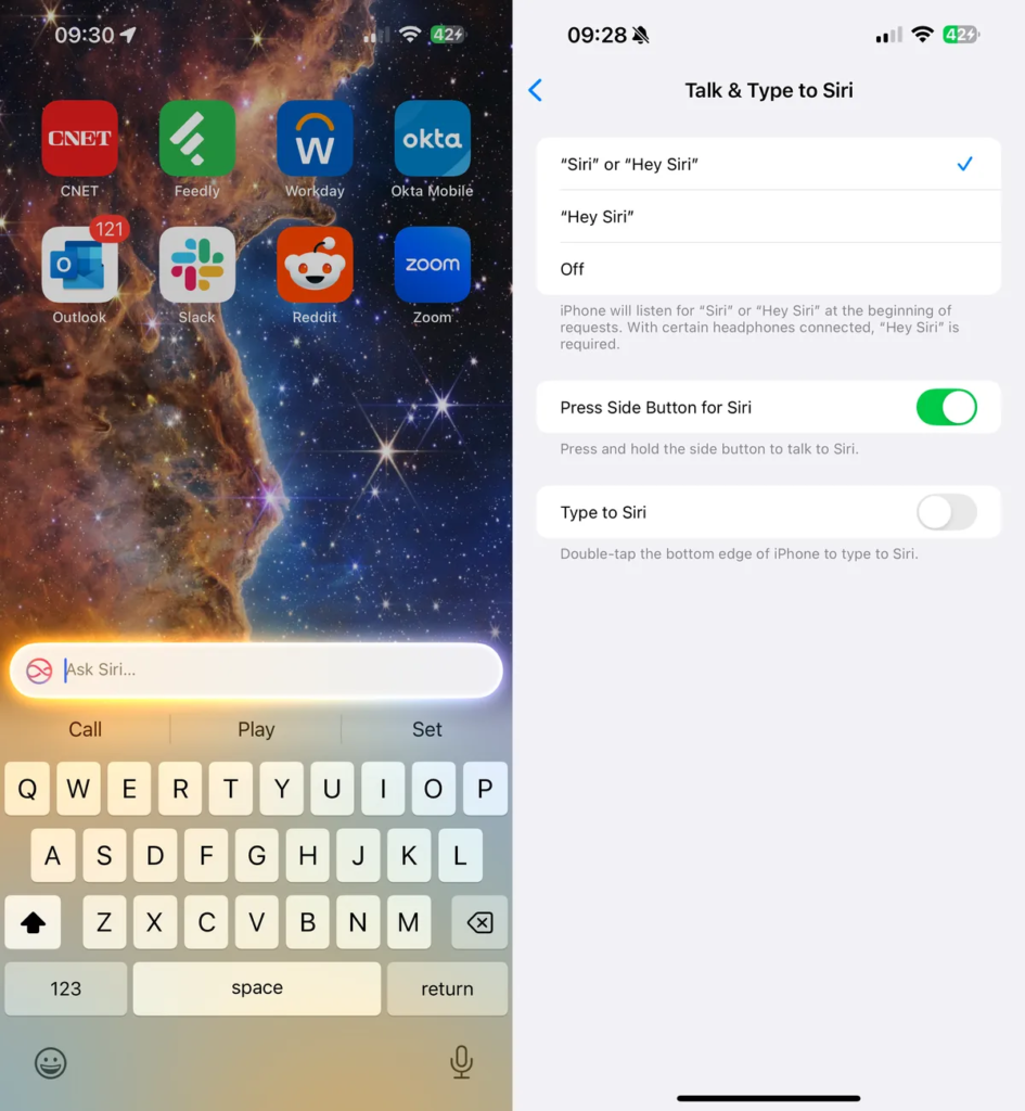
The big Siri AI upgrade everyone’s been waiting for isn’t coming until next year, but if you’re in the iOS 18.1 public (or developer) beta (here’s a full guide on how to download it) and have an Apple Intelligence-compatible iPhone, you may have noticed that Siri is getting a glow.
Instead of the Siri ball you’re used to, the edges of your iPhone’s screen will glow different colors when the assistant is listening to you. It’s a welcome design change, even if Siri lacks the expected Apple Intelligence features, but there’s one aspect of the new Siri that keeps bugging me.
Double-clicking the bottom-center of your iPhone brings up the Write to Siri feature. This lets you type to Siri instead of speaking, which brings up a keyboard at the bottom of the screen. It’s a useful feature if you’re in a situation where you need to be discreet, but I still seem to accidentally activate the feature, especially when I’m typing or swiping my phone.
However, there is a way to turn off Typing to Siri without disabling the assistant entirely. In Settings, go to Apple Intelligence & Siri > Speak and Type to Siri and turn off Type to Siri.
