New iPhone 16? First Change These 7 Settings in iOS 18
If you're setting up a new iPhone or upgrading an earlier model, start here to get the most out of iOS 18.

There’s so much going on in the recently released iOS 18—custom Home screens, iPhone screen mirroring, new Messages formatting, and animations—that it’s hard to know where to start. If you buy the iPhone 16, you’ll also need to unwrap the new Camera Control feature.
To help you get started, I’ve compiled a list of seven features and settings you should tweak right now, including some big-ticket features and some that fly under the radar. While Apple Intelligence isn’t here yet (unless you’ve installed the iOS 8.1 public beta), there’s still plenty to explore.
For more on what’s new in iOS 18, check out the improvements to Apple Maps and the Messages app . Be sure to check out our iOS 18 upgrade checklist , which includes making sure you have a proper backup before upgrading.
Change the Default Lock Screen Buttons
In real estate, location is everything, and the bottom corners of the iPhone’s Lock screen are key, as each can be easily pressed with your thumb while your device is still locked. Before iOS 18, these buttons were anchored by the flashlight and camera buttons, with no way to change them.
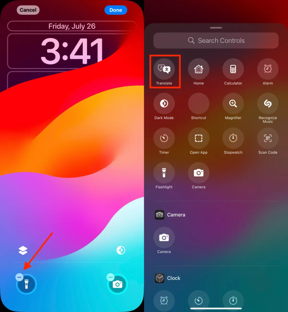
In iOS 18, you can finally replace them with other buttons — or remove them altogether, which is a boon for people who unknowingly turn on the flashlight (trust me, there’s a better way to turn it on). You can add buttons to recognize music via Shazam, turn on dark mode, set an alarm/timer, turn on airplane mode, open your wallet, send money via Tap to Cash, and more.
Here’s how:
- On the iPhone Lock screen, touch and hold anywhere on the screen until the Personalization button appears. You’ll need to unlock the phone using Face ID, Touch ID, or your passcode. If the Home screen is open, swipe down from the top-center of the screen (not the right edge, which opens Control Center.
- Click Customize, then choose Lock Screen.
- Remove a button by clicking the – (minus) button on the icon.
- To replace the button with a different function, tap its space (which now contains a + symbol), then choose the function you want on the next screen. (You can also choose to leave that space blank without a button.)
- Repeat these steps for the other button if you want to change it.
- Click Done when you’re done.
- Tap the Lock screen again to exit customization mode.
Getting new tasks available on the Action button
The Action button on iPhone 15 Pro and iPhone 15 Pro Max replaces the dedicated mute switch found on all other iPhone models with a configurable control. By default, it has the same purpose — tap it to turn silent mode on or off — but you can configure it to do something else, like open the camera app, perform multiple actions, or even order a coffee.
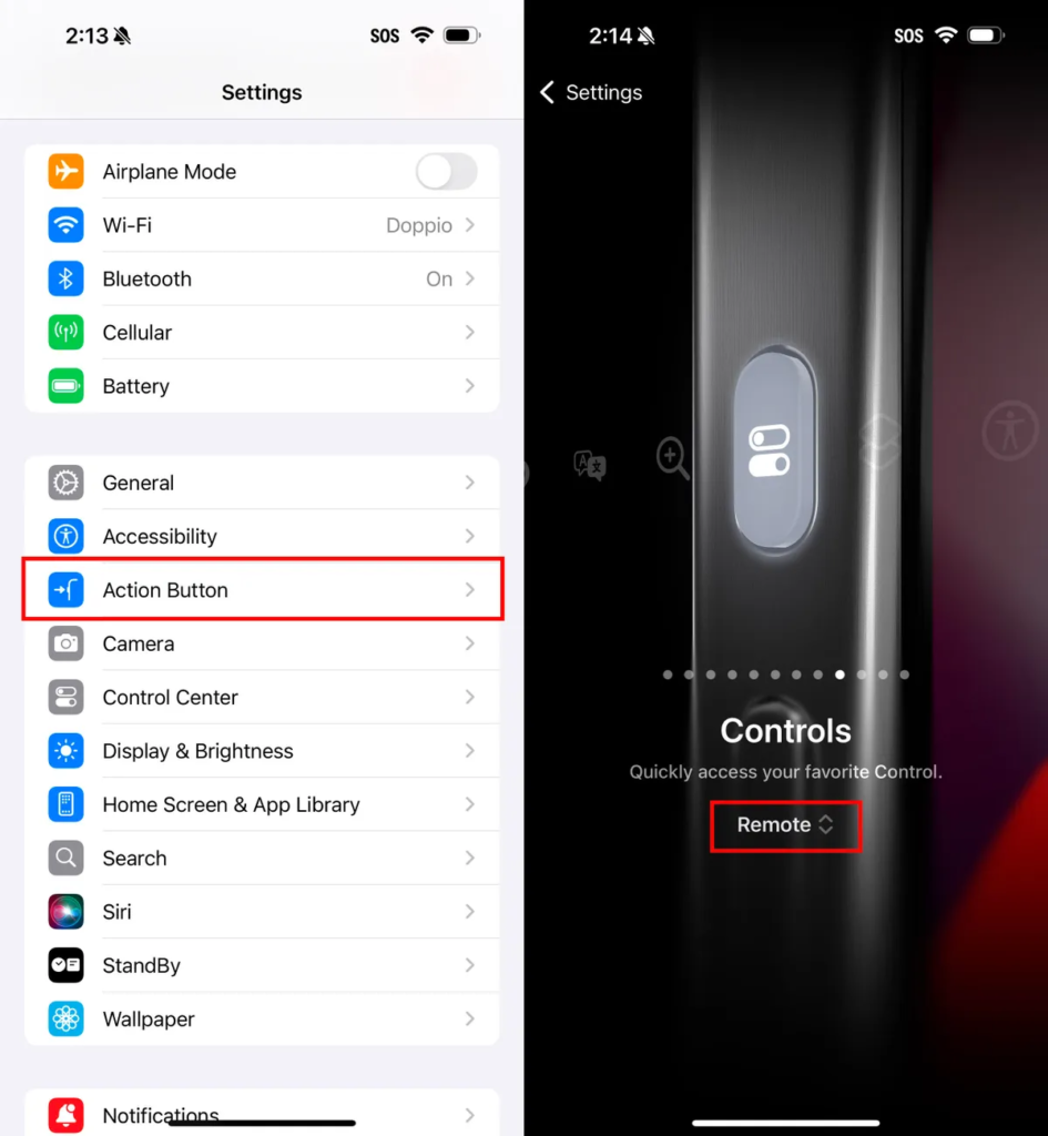
In iOS 18, the Action button is getting some new features. You can bypass Control Center and choose a command of your choice, like opening the remote to navigate Apple TV or using Shazam to select a song.
To choose a different action for the Action button, go to Settings > Action Button. Swipe sideways to select and activate one of the available actions. For Controls, Shortcuts, and Accessibility, click the Choose button to choose the specific action you want to perform.
Give your Home screen a radical new look
You wouldn’t think that placing icons where you want them is a radically new feature, but that’s because iOS has always had a locked-down arrangement. Apps are added from top to bottom and left to right. You can rearrange the order in which the icons appear and move them to other screens, but that’s about it.
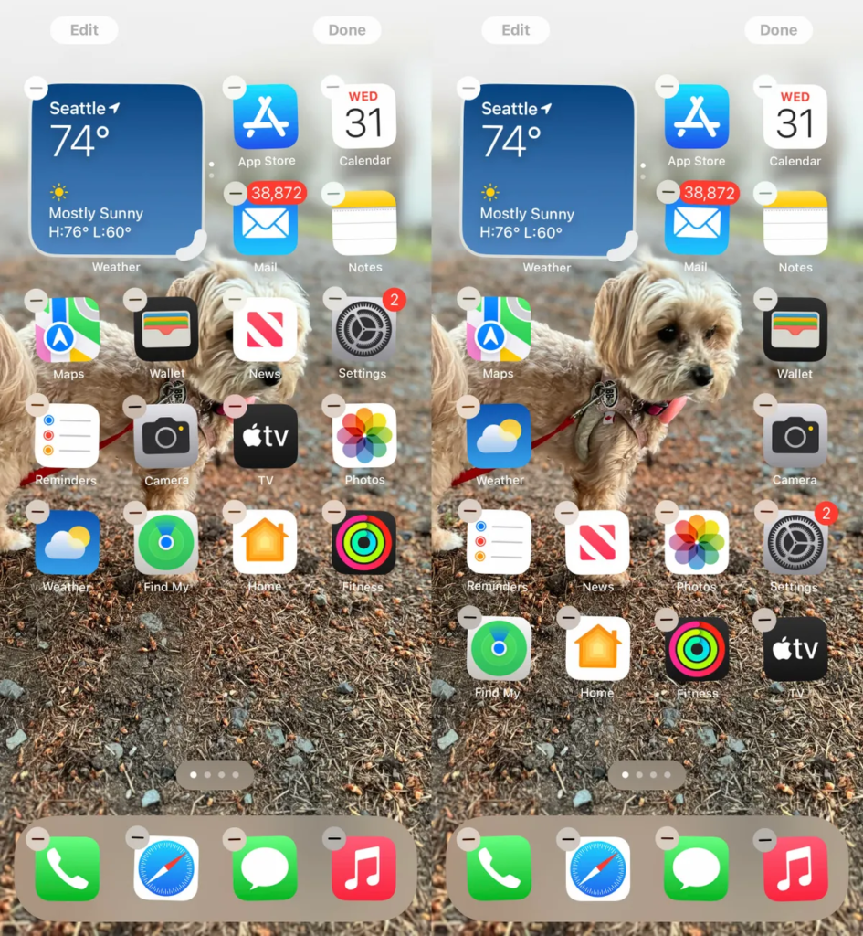
In iOS 18, apps can be placed almost anywhere, and you no longer have to deal with a background image of your kids or pets obscured by icons. It still adheres to a grid—Apple has no intention of imposing clutter—but it can be placed freely.
Additionally, dark mode finally applies to the entire iPhone Home screen, with options to color icons and affect the brightness of the background image. Here’s how to customize the look.
Arrange apps: Long-press on the Home screen to vibrate, then drag icons to new positions. They’ll still be able to move them around to fill spaces, but with patience, you can move them to the places you want.
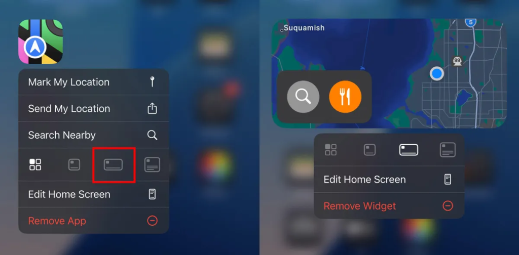
You can also quickly turn compatible apps into widgets that show more information. For example, Maps can be a map of your current location with shortcut buttons to search for places or view a list of nearby places (like places to eat). Long-press the app icon and look for a row of resize buttons in the menu that appears. Once it expands beyond the standard icon size, you can drag the handle in the lower-right corner of the new icon. To return it to single-icon size, you’ll need to tap and hold it again and choose the single-icon button.
Set Dark Mode: If you’ve ever subjected yourself to a retinal explosion of black text on a white background late at night in a dark room, you’ll appreciate the new Dark Mode option for the Home screen and Lock screen. iOS previously included a Dark Mode, in which light backgrounds turn black or dark gray, text turns white or light gray, and other interface elements are dimmed to coexist in a dark environment. This wasn’t implemented in any meaningful way on the Home screen and Lock screen—just the Dock and some widgets—until iOS 18.
First, touch and hold the Home screen to toggle Vibrate mode. Click the Edit button in the upper-left corner and choose Customize from the menu. At the bottom of the screen, choose a mode for your icons and wallpaper: Auto, Dark, or Light (I’ll get to color in a moment). In Dark Mode, icons get a black background, and folders and the Dock turn a dark gray. (Developers have the option to create Dark Mode icons for their apps. Meanwhile, apps that haven’t been optimized yet have an overall darker look.)
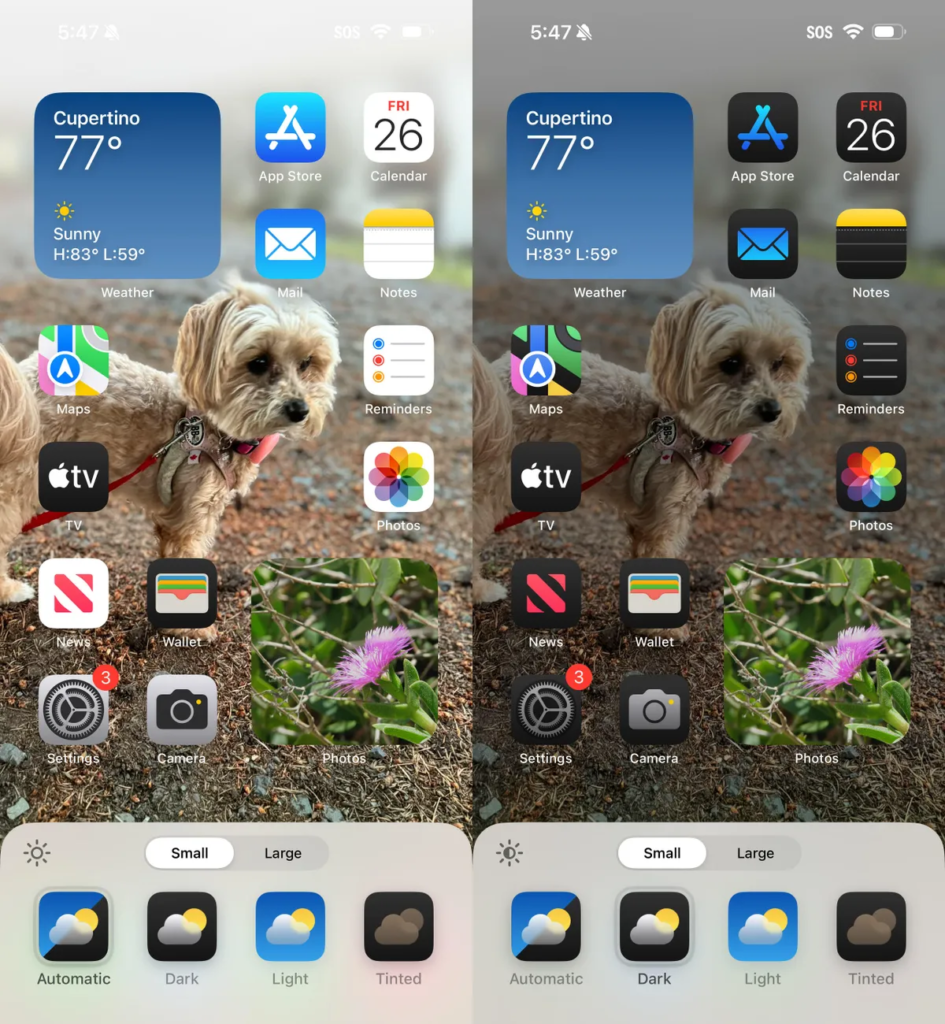
In Dark Mode, the background image also changes. Apple’s default iOS 18 wallpaper dynamically changes from light to dark as the day progresses, or you can choose colors that offer a light and dark option. If you use a photo, its overall exposure is reduced to reduce the light output.
If you want dark icons but aren’t a fan of the dark image treatment, tap the sun icon in the corner of the options sheet at the bottom of the screen to return to light wallpaper mode only.
Colored icons: A new and different option is to color all app icons so that they share the same color. In the customization options at the bottom of the screen, choose Colorful as your icon style. You can then adjust the Hue (a slider containing the color spectrum) and Brightness (a slider containing the range from dark to light) to choose the shade you prefer.
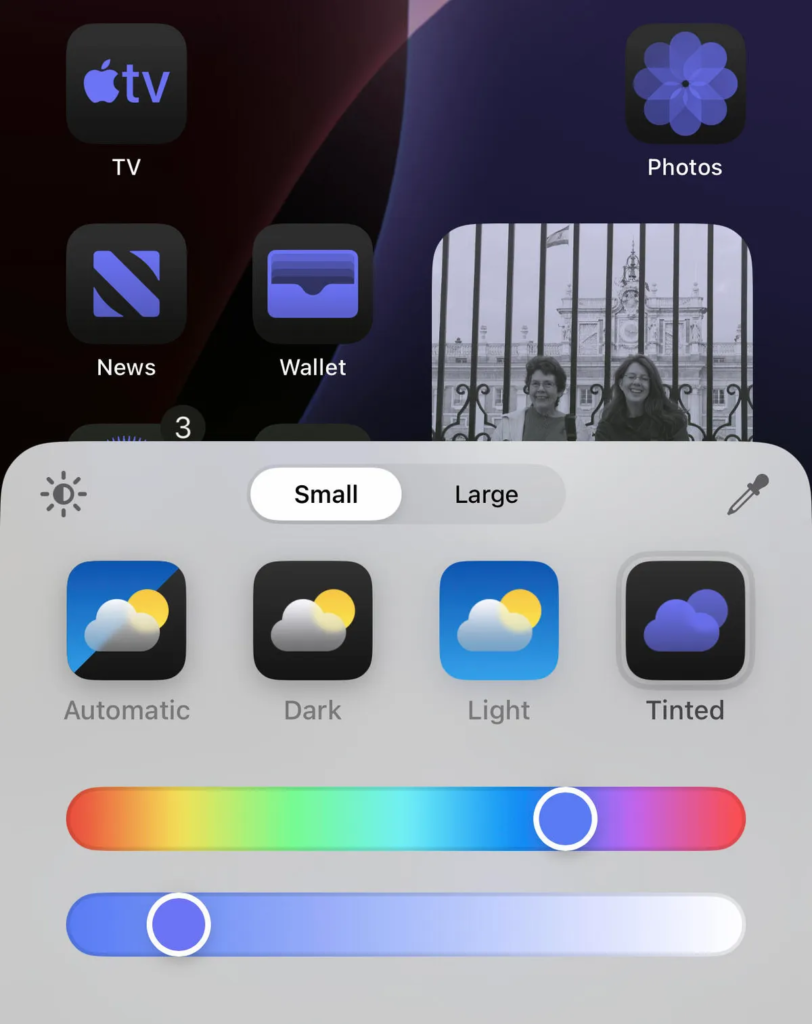
What if you want to match the color of a background image? Click the Eyedropper button, then drag the grid to select the color you want: the line indicates the selected color.
The tone is applied not only to the icons, but also to the widgets. For a widget like Images, the images you display appear in two colors to match the theme.
Large icons: Do you find the labels under each app icon unnecessary? Now you can remove labels and increase the size of the icons with a single setting. Open the customization options as shown above and click the big button.
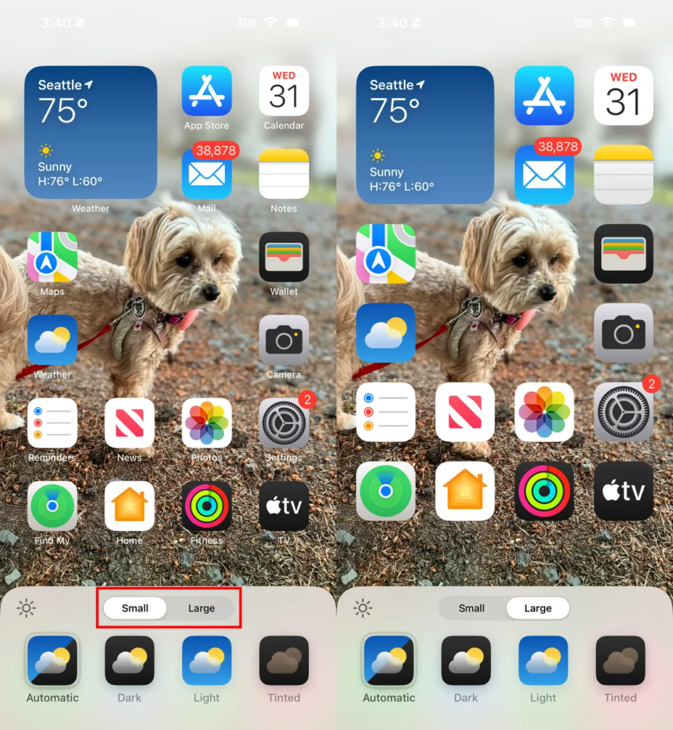
After making any of these changes, tap anywhere on the screen to apply them and exit the customization interface.
Open next page to continue reading


